Is this the most ridiculous post I’ve ever done? Probably. But I promise you’ll enjoy it anyway. It’s pretty self explanatory. There are a lot of awful sports logo’s, but most of them are just boring. This one is focusing on the ones that are so bad, you can’t help but laugh at them and wonder “What meth addict decided that one be a good idea for a logo?”
Now, lets get to it!
10. Cleveland Indians (Current)
This is the only logo on this list that is a current logo, but I had to include it. It blows y mind that in a day and age where everyone is offended by everything, the Cleveland Indians are allowed to have an enormous, RED, smiling Native American face, named CHIEF WAHOO! CHIEF WAHOO! What??
9. San Diego Padres 1970’s and 80’s
I would buy a T-Shirt with these logo on it. A creepy looking Friar, awkwardly swinging a large baseball bat? Yes please! The Padres should switch back to this. They are pretty much the most boring team in baseball, do something to spice things up.
8. Denver Nuggets (1975)
Congratulations to the Denver Nuggets for having two logos on this list and for winning the title of “Most Blatant Rip Off Of A Character From Rudolph The Red Nosed Reindeer” by pretty much having Yukon Cornelius as their logo.
7. 1995-96 New York Islanders
With the angry face, fisherman’s outfit and what appears to be a sweet orange tan, that guy looks like a cross between a Jersey Shore cast member and the killer from I Know What You Did Last Summer. Seriously, just replace the hockey stick with a hook and play some house music and it’s complete.
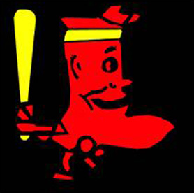
6. 1950’s Boston Red Sox
Its obviously a bizarre, terrible logo, but my main question is why is the sock wearing a yellow headband? If the Sox get off to a bad start this year, they should announce they are switching back to this thing to distract the fans.
5. 1960’s Cleveland Browns
That’s just a creepy dude right there. He reminds me of Gollum from Lord of the Rings. I used to wonder why the Browns logo now is simply their plain, orange helmets with nothing on it, but its probably because this elf looking motherfucker scared children in the Cleveland area so badly that the Browns were banned from ever having a logo again.
4. 1980’s Denver Nuggets
I’m not gonna lie, I love this logo. It’s terrible, but I love it and everything about it. The buildings look like someone is playing Tetris with a nice little mountain landscape in the background.
3. Fort Wayne Pistons (1940’s and 50’s)
The Pistons were accused of throwing games and losing the 1955 Championship on purpose. If I was running about with a big picture of the Tin Man from Wizard of Oz on my jersey, I’d probably hate life and lose on purpose too.
2. 1970s-90s Tampa Bay Buccaneers
Look, I don’t mean to offend here, but maybe having a flamboyant, winking pirate with flowing hair and a cute little sword in his mouth isn’t the best idea for a football logo? The best part about this one is that he not only has a name, but his name is Buccaneer Bruce! If I asked you if Buccaneer Bruce was a Tampa Bay area gay bar or the name of a football mascot, there is no way you’d guess mascot right?! In a related story, the Bucs went 0-14 in 1976 while wearing this jerseys.
1. Detroit Tigers 1927
Wow. I honestly think that the Tigers had a contest where fans submitted drawings for what the next Tigers logo should be and they meant to put this one in the “holy shit this is hilarious, lets save this just to laugh at later” pile and put it in the “potential winners” pile by accident and someone just ran with it. Its the only explanation. Look at that thing! It looks like a raisin a face drawn on it! Shockingly, this logo only existed for one year before being replaced.


come on you cant put the old bucs logo on here, its just classic!
Hahaha oh dont get me wrong I love ole Buccaneer Bruce! He is pretty cheesy though haha